
12 / Colour
Institutional colours
CIE Blue establishes institutional trust; CIE Cyan signals action and navigation. Present each colour individually and at scale.
CIE BLUE#00338D
CIE CYAN#0097DC

CIE / DIGITAL BRAND GUIDE / V5.0
The responsive HTML guide to the CIE logo, lock-ups, colour, typography, layout, imagery, stationery and digital applications.
The user-approved CIE-logo-master.ai is the sole geometric master for lock-ups (SHA-256: d8943baa…). The v5 PDF and web specimens are derived applications and cannot override it.
Download the PDF brand guide00 / Start
Define the use case, then select the approved logo, lock-up, colour and template. Formal output always begins with a master asset.
01 / Identity
Reinventing Your Possibilities accompanies first or primary institutional appearances. It is a controlled lock-up, not a separate logo.
ReinventingYour Possibilities
The claim aligns to the optical centre of the letterforms. No rule is added.
02 / Logo
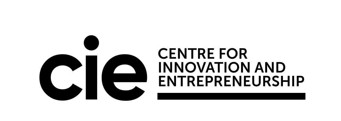
The master combines the original cie logotype, three-line institutional name and baseline. This right-hand lock-up is the sole formal master.
03 / Logo
The formal master uses four approved colour settings: CIE Blue / Light, White / Blue, White / Black and Black / Mono. Every field must preserve generous breathing room; never recolour or redraw ad hoc.
04 / Logo
The mark occupies approximately 40.5% of the full lock-up width. Descriptor and mark align optically, not by their bounding boxes.
05 / Logo
x equals the diameter of the i dot; keep at least 1x on all sides. Minimum master width is 220px digital or 48mm in print.
At least 1x · Digital ≥ 220px · Print ≥ 48mm
06 / Logo
On portrait formats the schematic logo width should not exceed 38.2% of the format. A4 production uses 48mm, approximately 22.9% of the sheet width. Top, bottom and footer positions share one inset and an optical baseline.
07 / Lock-ups
Set the claim in Museo Sans 700 at 22.7pt / 23pt leading / tracking 0. Add no rule, and centre the complete lock-up optically rather than around the circular c.
ReinventingYour Possibilities
08 / Lock-ups
Names follow cie directly with no rule. Place names use Museo Sans 700 at 57.0% of mark width with a 10.8% gap; the name baseline meets the cie bottom. Institution families use the same bottom-led logic.
Institution family
UNIVERSITYDriving Innovation
Place family
SHEN ZHENSINGAPORE09 / Lock-ups
Community names follow cie with a controlled gap and one optical bottom line. The name must not sit low, gain a rule or dominate the logotype in height.
ROBOTICS CLUB10 / Lock-ups
The divider is 78.0% of mark height. Descriptor type is 11.0% of mark width with an 11.2% line advance; the divider and text block share the letterbody axis at 64.8% of mark height.
AICENTRE
11 / Lock-ups
Give CIE and partners equal breathing room and a clear hierarchy. Never show a partner name or mark before confirmation.
TSINGHUA UNIVERSITYCAMPUS PARTNERS
12 / Colour
CIE Blue establishes institutional trust; CIE Cyan signals action and navigation. Present each colour individually and at scale.
13 / Colour
Purple, Red, Teal and Green distinguish pathways and states. They are not decorative accents.
14 / Colour
Cyan, Purple, Red, Teal and Green fields use the approved Reverse White formal master. Keep the logo large and place explanatory text in a white caption area.
15 / Colour
The five lock-ups change only the approved rule colour. Mark, dot placement, institutional name, proportion, spacing and optical alignment all come from the same Illustrator master and must never be rebuilt ad hoc.





16 / Colour
Use only 100%, 60%, 24% and 12% of each brand colour. Do not invent near-hues or weaken the master palette.
17 / Colour
Use small white type only on backgrounds with sufficient contrast such as Blue, Purple and Red. Body text on Cyan, Teal and Green uses CIE Ink.
* Small or light body type on Red still requires size- and WCAG-level review.
18 / Type
Museo Sans is the Latin brand typeface: 100 for editorial display, 500 for body text, 700 for navigation and lock-ups, and 900 for emphasis. Pair it with Noto Sans SC / Source Han Sans or PingFang for Chinese.
Aa 未来
Possibilities
Webfont note: the site currently calls locally installed Museo Sans. A licensed WOFF2 webfont package is required for consistent delivery to every visitor. Strong negative tracking for Latin display type is not applied to Chinese headings.
19 / Layout
A twelve-column grid, 7.5vw desktop margins, decisive scale contrast and generous space create the CIE editorial layout.
12 columns / 7.5vw margins / decisive scale / generous space
20 / Layout
The supergraphic is a crop and enlargement of the approved mark. It is a background device, not a new logo, and its letterforms never change.
The crop may bleed; the letterforms never distort. It is not a second logo.
21 / Layout
Edge, Counter and Dot share one mark scale and bottom anchor; only the horizontal crop changes. Every crop must create stable negative space while retaining recognisable letter structure.

22 / Imagery
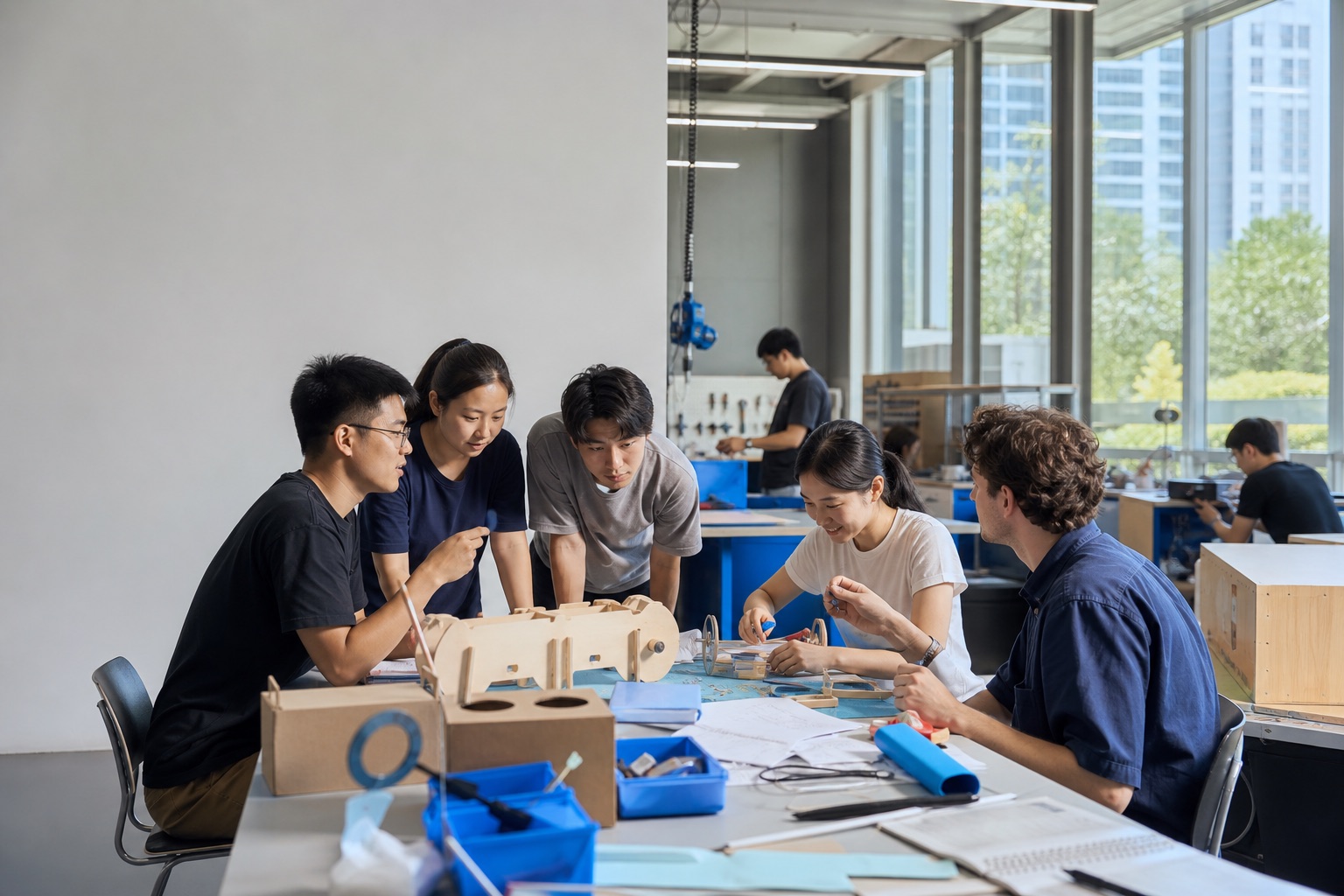
Show real people, making and moments of judgement. Avoid staged handshakes, empty tech effects and contextless device close-ups.

23 / Applications
The A4 letterhead uses a 48mm formal master, 18mm top and left margins, a top-right contact block, a 146mm text measure and a dedicated signature zone. The default is a clean white sheet without decorative rules or a repeated footer. Supplied files are production candidates and require proofing before print.
CIE / SHENZHEN · CHINAhello@cie.comcie.comDear Partner,
RE: CIE PROGRAMME PARTNERSHIPSincerely,NAME SURNAMETitle / CIENAME / ROLE
hello@cie.com
DOCUMENT FOLDER24 / Applications
Covers, chapters, data, cases and closing pages share an editorial grid. Digital experiences prioritise content, hierarchy and accessibility.
01
86%DATA25 / Applications
Posters, social graphics, wayfinding and merchandise establish information hierarchy first, then select one lead colour and image. The logo is never decoration.
2026 / SHENZHEN / 19:00
PROTOTYPING
LEVEL 02Recognition at distance comes before decoration.26 / Governance
All formal output begins with a master. New lock-ups, partner marks, sub-brands, webfonts and production files require brand-owner review.